What the Alberta Covid-19 Dashboard Data Really Says
Evidence of data blending, conflation, obfuscation, and a false narrative told by Alberta's Covid-19 Data
The first time I heard the slogan “pandemic of the unvaccinated” was in the spring of 2021. I was immediately suspicious, because it was so obviously a slogan meant to convey one thing. That the unvaccinated were the source of the plague and the only moral decision was to get vaccinated.
In the coming months that slogan was repeated ad nauseum. I tried to zone it out and ignore all the noise as much as possible, but that all changed when Jason Kenney, Premier of the Canadian Province of Alberta flipped from his very public opposition to the vaccine passports to their implementation and enforcement. I knew I had to do something, but what?
That slogan, chanted with such precision and certainty by so many was still stuck in my head, and with it questions…lots of questions. Was it true? What does the data say? Can one even determine anything from publicly available data? Where do I start?
Every province in Canada has a Covid-19 Dashboard. Having gone to university in Alberta and lived there for many years, it seemed like a good place to start. Boy was I right. I never left.
https://www.alberta.ca/stats/covid-19-alberta-statistics.htm#highlights
The dashboard is updated each weekday except holidays. I began capturing the daily updates on October 4th, then forgot about it, but came back in earnest on November 4th. Since then I missed some days, over Christmas for example, but for the most part I captured each day.
Most of this discussion will focus on the “Vaccine Outcomes” tab of the Alberta Covid-19 dashboard. This tab seems to be very simple, and the message it conveys is clear, “the vaccines are safe, the unvaccinated are the main danger” In other words, it is the slogan “pandemic of the unvaccinated” told with numbers. But does the data support this image?
This article will show that the Alberta Covid-19 dashboard appears to be a carefully curated tool designed to paint a picture of vaccine efficacy and safety, that truly this is a “pandemic of the unvaccinated”. It will show a high degree of variable blending and obfuscation; incorrect and unscientific data conflation; and potential incompetence or malfeasance. It will reveal that once those levels of data obfuscation are removed, the data itself paints a much different and more truthful picture. This is done using the exact same numbers Alberta’s Covid-19 dashboard presents and it raises A LOT of questions.
Are those in charge of the Alberta Covid-19 dashboard simply incompetent or are they very competent and cunning? Are they purposefully blending, mixing, obscuring, and adding irrelevant and/or incorrect data to increase certain cumbers and decrease others, or do they just not know what they are doing? The most important questions are simply why and by whom? Whatever the case, Albertans deserve better. We must demand answers and full transparency.
Figure 1: Daily summary section of the Alberta Covid-19 Dashboard
Figure 1 is a screen capture from Nov 8th of the daily update which includes data up to Nov 4th, 2021. Shown here is a list of bullet points from the upper section of the page. The first reads, “Since Jan 1, 2021” 0.3% of people with one dose (number of cases/number of shots) were diagnosed with Covid-19 14 days after the first immunization date”.
As soon as I read this first line in early November my data analysis ears perked up. This seemed like propaganda presented as science. It has some numbers, percentages, ratios, and fancy words written in ways that are confusing if you think about them, but pretty clear if you don’t. Before I even got past the first bullet point, questions were running through my mind.
· Why do they go all the way back to Jan 1, 2021, when they only started giving the shots in earnest in March & April?
· Why is 0.3% bolded but nothing else?
· If that many people were diagnosed “14 days after” their shot, how many were diagnosed on the 13th day, the 12th, the 15th after their first shot?
· Does “14 days after” their shot means the first 14 days after a shot (day 1 – 14), or day 15 onwards?
· Why am I so confused already?
These questions are critically important and must be applied to all other points in the upper section. With each passing bullet point, more and more questions arose. The precise answers were unclear, but it seems obvious each bullet point was designed to tell a story that was probably not true. At the same time, I was confident the real picture could be extracted, but it would take some time. I needed daily data for a few months at least, and I needed to understand what the numbers represented.
The second bullet point is the same as the first, but for the second shot.
The third bullet is the number of cases “Since Jan 1, 2021” who were “unvaccinated or diagnosed within two weeks from the first dose immunization date”.
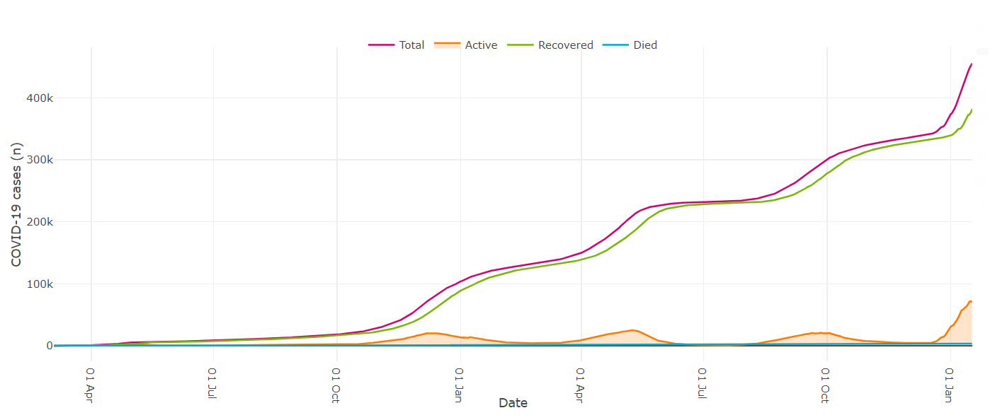
This is where the Jan 1, 2021, becomes important to the story. Figure 2 shows there was a large outbreak in December 2020 which carried on into February 2021, and another one in April through May. Both outbreaks had tens of thousands of cases, and almost all of them would have been unvaccinated because the vaccination campaign only shifted into high gear in April 2021. There are also cohorts of the population who could not be vaccinated for significant portions of the year, so all cases in those cohorts would be included in this statistic. For example, Alberta started vaccinated 12–18-year-olds in May, so 100% of cases in those under 12 before that date were unvaccinated. It is clearly an incorrect and unscientific way of presenting this data.
Figure 2: “Total Cases” chart showing Covid-19 Cases in Alberta with Time
Figure 3: “Vaccinations” chart showing Covid-19 Cases in Alberta with Time
The next two bullet points present the numbers for Hospitalizations and Deaths in the same manner.
The result is that if someone went to the Vaccine Outcomes page on Nov 8th, 2021, they would get the impression that only 0.3% and 0.8% of those who took the first and second shots got Covid-19, but 83.9% of all cases, 84% of all hospitalizations, and 76.1% of all deaths were unvaccinated. Unless they were a trained and skeptical scientist like me, they would conclude the vaccines are safe and that not being vaccinated is unsafe.
Fortunately, the daily updates provided numbers to support their claims. Presenting numbers comes across sort of “sciencey”, and this would probably make the average person more confident because it seems they are being fully transparent. After all, one cannot argue with numbers, can you? “Trust The Science!”
Well, guess what? You can argue with numbers. In fact, it seems that is what Alberta’s Covid-19 dashboard is designed to do. But they did provide the numbers, and I realized I could use those numbers to extract the real picture. First, I had to understand what these numbers represented. This is extremely important. I thought a lot about this, and did a lot of analysis, and now I understand them as follows.
The numbers presented in the tabs (Figure 1) are cumulative. That means they are the total number of Cases, Hospitalizations, and Deaths since Jan 1, 2021. Each bullet point contains a numerator and a denominator, and each represents a different cohort or set of cohorts. The cohorts are:
· Unvaccinated: those who never took any shot at all.
· Within 14 days of 1st shot: those who are within 14 days of their 1st shot (i.e., day 1 – 14).
· Within 14 days of 2nd shot: those who are within 14 days of their 2nd shot (i.e., day 1 – 14).
· Past 14 days of 1st shot: those who are past 14 days of their 1st shot (i.e., day 15 onwards).
· Past 14 days of 2nd shot: those who are past 14 days of their 2nd shot (i.e., day 15 onwards).
Let us go through each bullet point using Figure 1 numbers.
· “Since Jan 1, 2021, 0.3% of people with one dose (11,304/3,268,155) were diagnosed with COVID-19 14 days after the first immunization date.”
o 11,304: the number of cases Past 14 days of 1st shot.
o 3,268,155: total number of 1st shots given as of Nov 4, 2021.
· “Since Jan 1, 2021, 0.8% of people with two doses (22,975/3,036,907) were diagnosed with COVID-19 14 days after the second immunization date.”
o 22,975: number of cases Past 14 days of 2nd shot.
o 3,036,9074: total number of 2nd shots given as of Nov 4, 2021.
Note: Starting on Jan 17, Alberta started included the same breakdown for the 3rd shot. It will not be addressed herein, although I am collecting that data now. I can say that the preliminary results look like the 2nd shot data.
· “83.9% of cases (186,922/222,179) since Jan 1, 2021, were unvaccinated or diagnosed within two weeks from the first dose immunization date.”
o 186,922: number of cases in the unvaccinated plus the number of cases Within 14 days of 1st shot.
§ This is data conflation. Clearly, those who never took any shot are different than those who took one. More on that below.
o 222,179: number of cases in all cohorts.
o The difference between the “all cohorts” (denominator) and “unvaccinated” (numerator) reveals the number of “vaccinated” cases.
§ Vaccinated cases since Jan 1, 2021: 222,179 - 186,922 = 35,257.
§ This is data conflation in which those Within 14 days of 2nd shot, those Past 14 days of 1st shot, and those Past 14 days of 2nd shot are merged into one variable (denominator). This is incorrect, but it how the data is presented, so these three groups are considered “vaccinated” in this analysis.
· “84.0% of hospitalized cases (9,236/10,989) since Jan 1, 2021, were unvaccinated or diagnosed within two weeks from the first dose immunization date.”
o 9,236: number of hospitalized in the unvaccinated plus the number of cases 14 days from 1st shot.
o 10,989: number of hospitalized in all cohorts.
§ Vaccinated hospitalized since Jan 1, 2021: 10,989 - 9,236 = 1,753.
§ Again, we see the numerator conflates two cohorts into one and the denominator conflates three cohorts into one.
· “73.3% of COVID-19 deaths (1,266/1,610) since Jan 1, 2021, were unvaccinated or diagnosed within two weeks from the first dose immunization date.”
o 1,266: number of deaths in the unvaccinated plus the number of cases 14 days from 1st shot.
o 1,610: number of deaths in all cohorts.
§ Vaccinated deaths since Jan 1, 2021: 1,610 - 1,266 = 344.
§ Again, we see the numerator conflates two cohorts into one and the denominator conflates three cohorts into one.
For the purposes of this analysis, the numerators of Cases, Hospitalizations, and Deaths are considered “unvaccinated” and the denominators minus the numerators are the “vaccinated”.
I took screen captures every day (I missed a few), extracted, digitized, and analysis the data. This allowed me to define the cumulative and percentage datasets, from Nov 4th, onwards. The pictures that emerged are much more accurate and scientifically rigorous than the simple “pandemic of the unvaccinated” picture presented in on the Vaccine Outcomes tab of the Covid-19 dashboard. It shows that the slogan is at best extremely flimsy if not completely refuted by Alberta’s own data.
The next section of the Alberta Health Covid-19 Vaccine Outcome tab is a table (Table 3) which displays just below that shown in Figure 1. It tabulates daily new Cases, Active Cases, and Hospitalizations. In this section they break down the numbers as “Complete”, “Partial”, and “Unvaccinated”. They show the numbers and percentages for each cohort to the right. The definitions of “Complete”, “Partial”, and “Unvaccinated“ are as follows:
Complete means: Past 14 days of 2nd shot (day 15 onwards).
Partial means: Past 14 days of 1st shot (day 15 onwards).
Unvaccinated means: those who never took a shot, those Within 14 days of 1st shot, and those Within 14 days of 2nd shot.
Figure 4: Number of cases from 1st shot (Left Hand) and 2nd shot (right hand)
The Note below the table states, “…vaccination categories only include those identified as cases over 14 days past their first or second immunization date”. That means that all cases recorded in the 14 days from 1st shot and 14 days from 2nd shot cohorts are included in the “unvaccinated” cohort on the table. Whether this is on purpose or due to incompetence is unclear, but it is clearly data conflation, and it is a different data conflation than what they did above meaning the “Unvaccinated” cohort definition here is different from the tab section as shown in Figure 1. This is at best disingenuous and unscientific. It is clear the results may be different if you’ve had a shot and those who did not, so they should be separated. From that we might ask what the data is telling us. Could including them in the unvaccinated cohort distort the picture?
Figure 5 is a histogram of the number cases diagnosed after taking the first (left hand plot) shot and the second (right hand plot). This plot was provided at the very bottom of the Vaccine Outcomes tabs, but it has been removed since Alex Berenson pointed it out.
https://alexberenson.substack.com/p/the-government-of-alberta-says-you/comments
Figure 5: Number of cases from 1st shot (Left Hand) and 2nd shot (right hand)
It takes no time or scientific training to see that the most likely time to be diagnosed with Covid-19, post - 1st shot, is immediately after the shot, especially within the first two weeks, and that means the shot is affecting that diagnosis. I do not know how, but it is plainly obvious that the post - 1st shot diagnoses of Covid-19 are in some way due to the shot itself. These data are artificially inflating the “unvaccinated” numbers in both Figures 1 and 4, but by how much?
We can see from Figure 5, on Nov 8th, 2021, there were approximately 11,000 cases that occurred in the first two weeks that were included in Alberta’s unvaccinated stats. This is the case for both the bullet point data shown in Figure 1 and the tabulated daily updates shown in Figure 4. Furthermore, the same thing occurs after the second dose, although the response to the shot is somewhat muted (Figure 5 righthand plot). There we see about 3,000 cases occurred within 14 days after the second dose. That means that as of Nov 8th, 2021, the total number of unvaccinated cases since Jan 1, 2021, could be incorrectly inflated by about 14,000. This is 7.5% of all “unvaccinated” cases since Jan 1, 2021.This inflation will be seen in the daily update data since Nov 4th, but by how much? We don’t know, but it is at least 7.5%.
When these are combined with the Covid-19 diagnoses after 14 days of both 1st and 2nd shots (first two bullet points on Figure 1), as of Nov 4th, 2021, there were almost 50,000 cases in people who had taken at least one shot since Jan 1, 2021. That is almost 25% of all cases in 10 plus months!! This is not at all obvious from how the data is presented on Alberta’s Covid-19 dashboard.
The current situation (Jan 19) is that there are about 160,000 post-shot cases in Alberta since Jan 1, 2021, out of about 350,000 total cases.
By Nov 8th, 2021, I knew the slogan “pandemic of the unvaccinated” was not supported by Alberta’s data, but I need more data. So, I collected the data daily and resisted the urge to over analyze. In early 2022 I started my analyses, and the results are shocking. See below.
Below I present the following plots which are just some of the results of my analyses.
1. Cases data:
a. Cumulative daily Cases since Nov 4th, 2021.
b. Percentage of daily Cases since Nov 4th, 2021.
c. Two plots are provided, one based on the bullet point data as in Figure 1 above, and one from the tabulated data as in Figure 4 above.
2. Hospitalizations:
a. Cumulative Hospitalizations since Nov 4th, 2021.
b. Percentage of daily Hospitalizations since Nov 4th, 2021.
c. Two plots are provided, one based on the bullet point data (Figure 1), and one from the tabulated data (Figure 4).
3. Deaths:
a. Cumulative Death since Nov 4th, 2021.
b. Percentage of daily Deaths since Nov 4th, 2021.
c. Only one of each plot is provided, because death data are not provided in tabulated data (Figure 4).
4. ICU Cases:
a. This data was recorded each day from Nov 4th, 2021, from the Highlights tab.
b. It does not break down vaccinated from unvaccinated, which is probably ok, given Jason Kenney’ recent admission that “a significant number” of patients are not there due to complications from Covid-19 complications. They were admitted for other reasons and were “diagnosed” with Covid-19 in hospital.
During a Facebook live video on Tuesday, Premier Jason Kenney revealed that a significant number of covid cases in Alberta’s hospitals are cases where covid is not the primary reason for hospitalization. #abpoli #cdnpoli
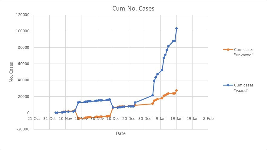
Figure 6: Cumulative Plot of Daily changes in in Cases from Tab data as shown in Figure 1
There are a few shocking observations from this plot.
First, there is an increase in the number of vaccinated cases, and a corresponding drop in the unvaccinated data on Nov 17th. Then a big swap in both numbers on Dec 9th. What was going on here? Was it simply human error, incompetence, or something else? I do not think it was a simple mistake because the number of unvaccinated cases lowered on Nov 17th is not the same as the increase on Dec 9th. If it were a simple mistake where someone clicked the wrong button, only to realize their error 3 weeks later and switch it back, the numbers would be identical. These were done on purpose, but why? The fact that they just made these changes without any explanation or public comment is highly unprofessional. Albertans deserve better.
Second, there have been 4 times as many cases in the vaccinated than the unvaccinated since Nov 4th, 2021. There is a clear departure between the two curves on Dec 24th, but even before that, both cohorts were roughly equal.
Figure 7: Cumulative Plot of Daily changes in Cases from Tabulated data as shown in Figure 4
The plot of the cumulative cases, shown in tabulated form (Figure 4). It shows the same trends in cumulative cases. That is, about 3 times more cases in vaccinated than in the unvaccinated group. I did not collect daily updates every day during the Christmas holidays. If I had, my analysis would show the number of vaccinate cases were higher, perhaps closer to 4 times that of the unvaccinated.
Another key observation here is that the classification shifts on Nov 17th and Dec 9th shown on Figure 6 are absent. This makes those data shifts even more mystifying.
What does this mean? Were the bulk shifts on Figure 6 human error, or were they something else? Human error can be forgiven, but I should note that those numbers were simply changed without any explanation. I find that harder to attribute to the incompetence.
What does the percentage data show?
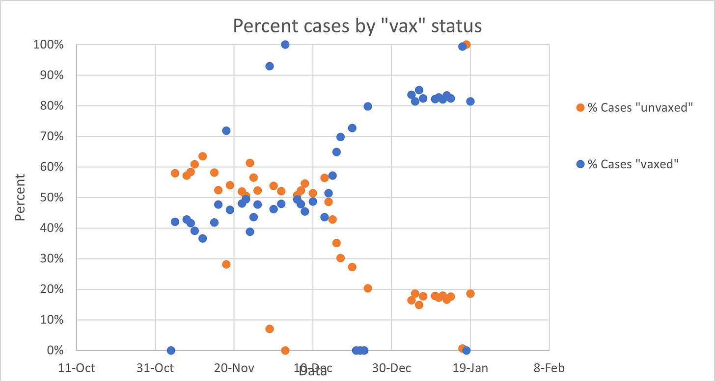
Figure 8: Daily Percentages of cases based on Tab data as shown in Figure 1
Figure 9: Daily Percentages of cases based on Tabulated data as shown in Figure 4
There are a couple of trends clear in both Figure 8 and 9. First we see that the percentage of unvaccinated cases was generally over 50%, but falling until Dec 14th, at which point everything changes. The current percentage of vaccinated daily cases is over 80%, and it seems to be holding. The current level of “fully vaccinated” people in Alberta, shown on the Vaccinations tab of the Covid-19 dashboard is 73.5%. That means the case rate in the vaccinated exceeds the vaccination rate by a fair margin. So much for the narrative “pandemic of the unvaccinated”.
Still, we are continually assured the vaccines prevent serious illness, hospitalizations, and deaths. What does the Alberta Data say about that?
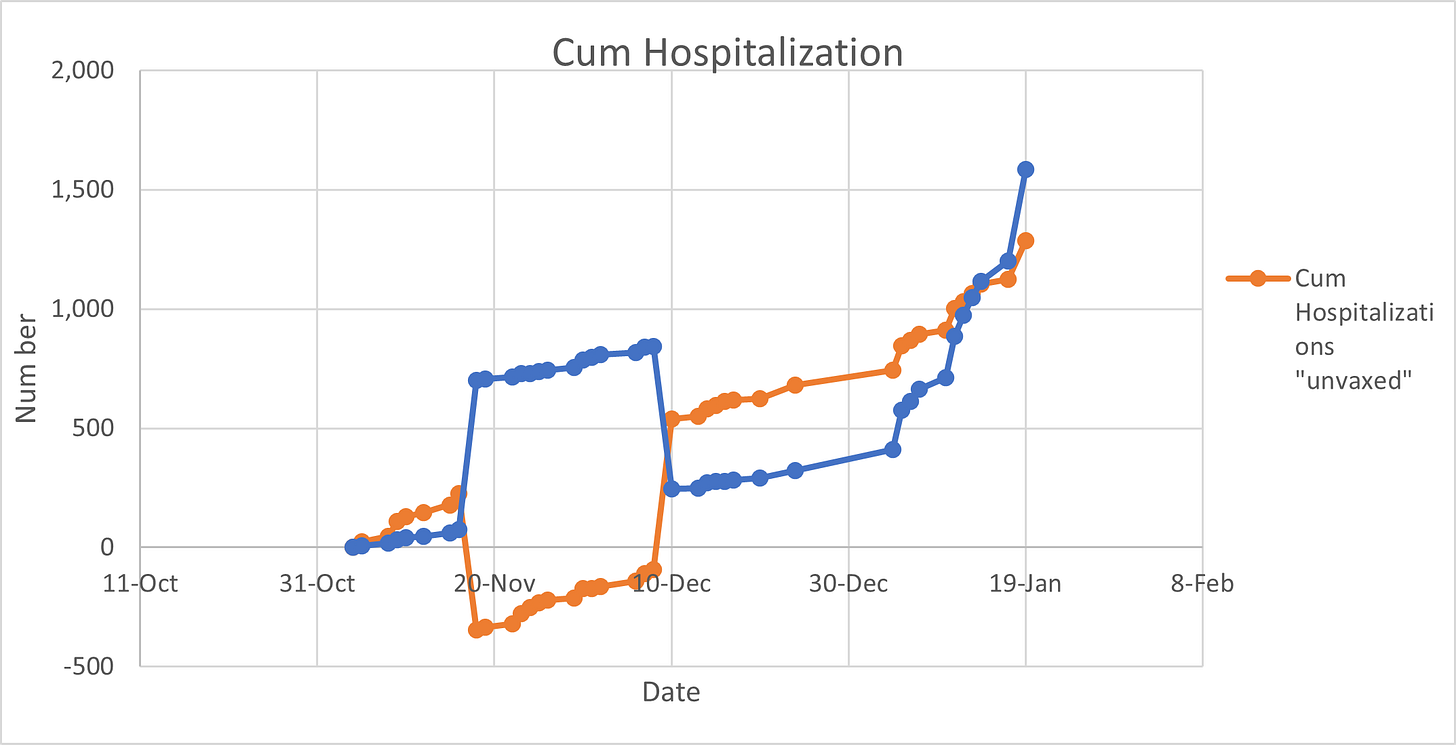
Figure 10: Cumulative Plot of Daily changes in Hospitalizations based on Tab data as shown in Figure 1
Figure 11: Cumulative Plot of Daily changes in Hospitalizations based on Tab data as shown in Figure 4
Figure 10 shows the same bulk data shifts on Nov 17th and Dec 9th, as was shown in the case data on Figure 6, but it also shows that there have been more Hospitalizations since Nov 4th in the vaccinated than in the unvaccinated.
Figure 11 shows there were a less Hospitalizations in the vaccinated than in the unvaccinated, but remember these data are missing weekend and holidays, several days over Christmas, and the unvaccinated cohorts are different between the two datasets. These data gaps are certainly affecting the cumulative number, so it might be better to look at the same data as percentages.
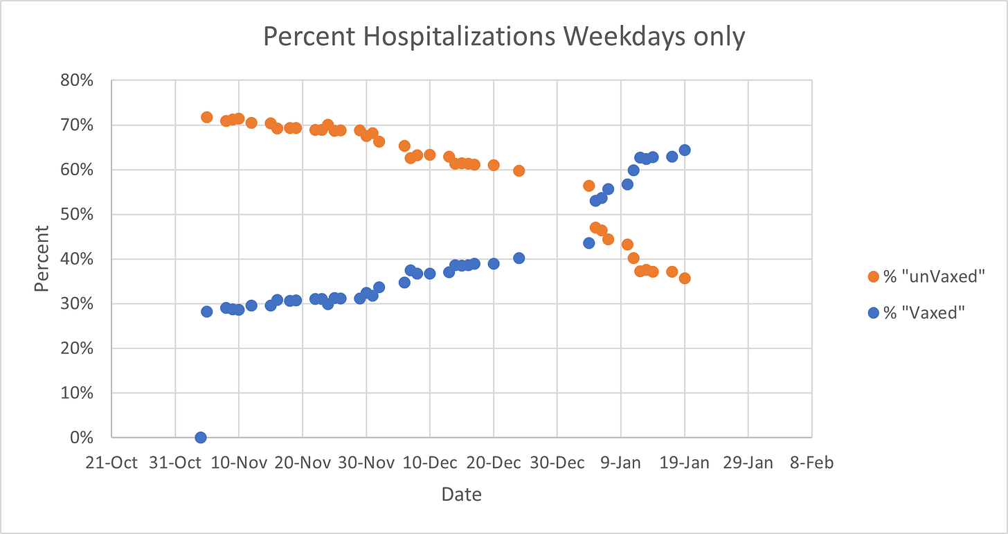
Figure 12: Daily Percentages of Hospitalization based on Tab data as shown in Figure 1
Figure 13: Daily Percentages of Hospitalizations based on Tabulated data as shown in Figure 4
Figure 12 and Figure 13 have similar but different motives. This is very unexpected and makes me suspicious of data in Figure 13. It looks closely curated, while the data in Figure 12 looks to contain inherent variability from day to day that would be expected in such a dataset. Why are the Figure 13 curves so smooth? Does Alberta have two separate teams working on the data, one of whom is making all kinds of mistakes and the other of whom is rigorous? I do not know, but Albertans deserve answers.
Still, they both show the same things. Hospitalizations in the vaccinated have been on the rise since Nov 4th, crossing over in early 2022, and the current rate of Hospitalizations in the vaccinated is between 65 and 80%. This is roughly equal to the overall vaccination rate in Alberta (73.5%), suggesting the shots do not significantly prevent Hospitalizations as we have been told.
But we have been assured time and time again that the shots prevent serious outcomes and deaths. What does the data say?
Figure 14: Cumulative Plot of Daily changes in Deaths based on Tab data as shown in Figure 1
Figure 14 shows that the cumulative number of deaths since Nov 4th, 2021. Interestingly the unvaccinated was less than 0 for about half the time since Nov 4th. How can this be? On Nov 5th the total number of unvaccinated deaths was decreased compared to Nov 4th. Again, this was done without explanation. The numbers were just changed. The number of Deaths in the unvaccinated was lowered again on Nov 17th, along with a corresponding increase in vaccinated deaths on the same day, as observed earlier in Cases and Hospitalizations. A reverse data switch occurred again on Dec 9th, after which time they remained relatively parallel until early 2022 when we see the vaccinated curve rising more steeply than the unvaccinated. While it is hard to fully trust data like this, it does show there have been more deaths in the vaccinated than in the unvaccinated since Nov 4th, 2021. What does the percentage data show?
Figure 15: Daily Percentages of Deaths based on Tab data as shown in Figure 1
Figure 15 shows the same pattern as we saw in Hospitalizations. That is continuously rising percentages in the vaccinated, with current numbers being about the same as current vaccination rates in the province. It seems the shots are having little effect on death rates.
Figure 16: ICU Cases from Highlights Tab
Figure 16 shows daily ICU cases generally falling until early 2022 where they abruptly tick upwards. Using the above Case, Hospitalizations, and especially Deaths data as a guide, this trend is likely to continue upwards for a while at least, and it will be predominantly the vaccinated cases.
Conclusion:
This analysis shows the slogan “pandemic of the unvaccinated” is just that, a slogan. It is simply not true. In fact, the data published by Alberta.ca shows there is little difference between the vaccination rate, case rate, hospitalization rate, and death rates. It shows that the Alberta Covid-19 dashboard has been presenting their data in an unscientific manner. I can only speculate why they did that, but it seems likely it was designed to paint the picture of vaccine efficacy and safety and that the unvaccinated are a danger to us all. This is the story that slogan conjured in the mind; however, that story is not supported by Alberta’s own data. There is certainly evidence that some of it is due to incompetence or human error, but it seems to me that it is the data are presented this way to make public believe something that is not actually supported by the data.
It appears to me that human error is not the answer. Rather, Alberta’s Covid-19 dashboard seems to be a carefully curated tool designed to present the data in a disingenuous, unscientific, and opaque manner, while appearing scientific and transparent. The data is extremely difficult to unravel and understand, even for trained scientists. In fact, it is impossible to completely unravel because the data is conflated, obscured, blended, massaged, and presented in a way that would never pass any legitimate scientific review process. Still, they do provide just enough data to allow the something close to the truth to be extracted, and the truth is, there is no “pandemic of the unvaccinated”, and everything they have promised us about these vaccines’ efficacy is at least not entirely true.
It is time for the Province of Alberta to begin presenting the data on the dashboard in an accurate and transparent manner. Stop blending and mixing cohorts and variables, explain the discrepancies and bulk shifts, and start being fully transparent with Albertans. Stop telling a story with the data. Just present the numbers.
This analysis shows there is no data-driven justification of vaccine passports or other discriminatory and segregation policies. It shows that the “vaccines will set us free” approach has failed. Whether you took the shots or not, it is clear from this analysis that Alberta has not been forthcoming to say the least. The same trends are almost certainly evident in the data of other jurisdictions, that are still clinging to the “vaccines or bust” approach.
This analysis brings forth more questions than it answers questions Albertans and the people in other jurisdictions must demand to be answered.










Welcome to the club, Rob! Excellent analysis and diligent work.
Great article Rob. Thanks for doing the hard work of scrutinizing the data and trying to bring clear, honest, scientific review to the matter.
Overall I think you make a very solid argument.
The one glaring assumption that underpins most of the AB governments thesis about vaccine efficacy is the assumption that in day 1-14 after vaccination the person is “un-vaccinated”.
This is wrong on several counts:
1. They are clearly different than someone who did not take any shot.
2. There is no research (that I am aware of) concretely backing up the claim that on Day 15 the human body magically is now “fully vaccinated”.
a. The process of MRNA has been described pretty clearly at this point. A synthetic genetic sequence in injected into the body, the cells respond to this code by manufacturing the spike protein of the SARS-Cov2 virus, the body’s immune system then sees the spike protein and responds by sending antibodies and T-Cells to the site to neutralize the spike protein.
b. This process starts immediately after injection…….and take roughly 2 weeks to reach full immune response. There is clearly a lot going on over this 14 day period. To say a person in this time window is the same as someone who did not receive the injected MRNA is patently false.
c. There is also the possibility that during this 14 day period, while the immune system is responding to the injected MRNA that it is more susceptible to natural infection from the wild Covid virus. I don’t know this as fact, but it should be studied. What is happening while the immune system is busy manufacturing all these antibodies and T-Cells, and then gets hit with the actual virus. Maybe they are better off than an un-vaccinated person, maybe they are worse off? They are definitely different!